A startup in the food safety space approached our agency with a single insight: compliance workflows — like temperature logs, waste tracking, and cleaning schedules — were still managed on paper, and often shared via WhatsApp photos. This made data hard to verify, harder to scale, and impossible to analyse.
A startup in the food safety space approached our agency with a single insight: compliance workflows — like temperature logs, waste tracking, and cleaning schedules — were still managed on paper, and often shared via WhatsApp photos. This made data hard to verify, harder to scale, and impossible to analyse.
They needed a system that could replace paper in high-pressure kitchen environments — and turn daily routines into structured, usable data.
They needed a system that could replace paper in high-pressure kitchen environments — and turn daily routines into structured, usable data.
My role
My role
Led the project end-to-end as the sole designer:
Defined product scope and UX approach from zero
Created all wireframes, prototypes, and final UI
Designed a modular system optimised for tablet use
Built a scalable design system to support implementation
Supported developer handoff and QA
Led the project end-to-end as the sole designer:
Defined product scope and UX approach from zero
Created all wireframes, prototypes, and final UI
Designed a modular system optimised for tablet use
Built a scalable design system to support implementation
Supported developer handoff and QA
The brief wasn’t just to build a digital product. It was to design a tool that would be actually used - by kitchen staff, mid-shift, wearing greasy gloves, in bright lighting, under time pressure.
The brief wasn’t just to build a digital product. It was to design a tool that would be actually used - by kitchen staff, mid-shift, wearing greasy gloves, in bright lighting, under time pressure.

Problem
Problem
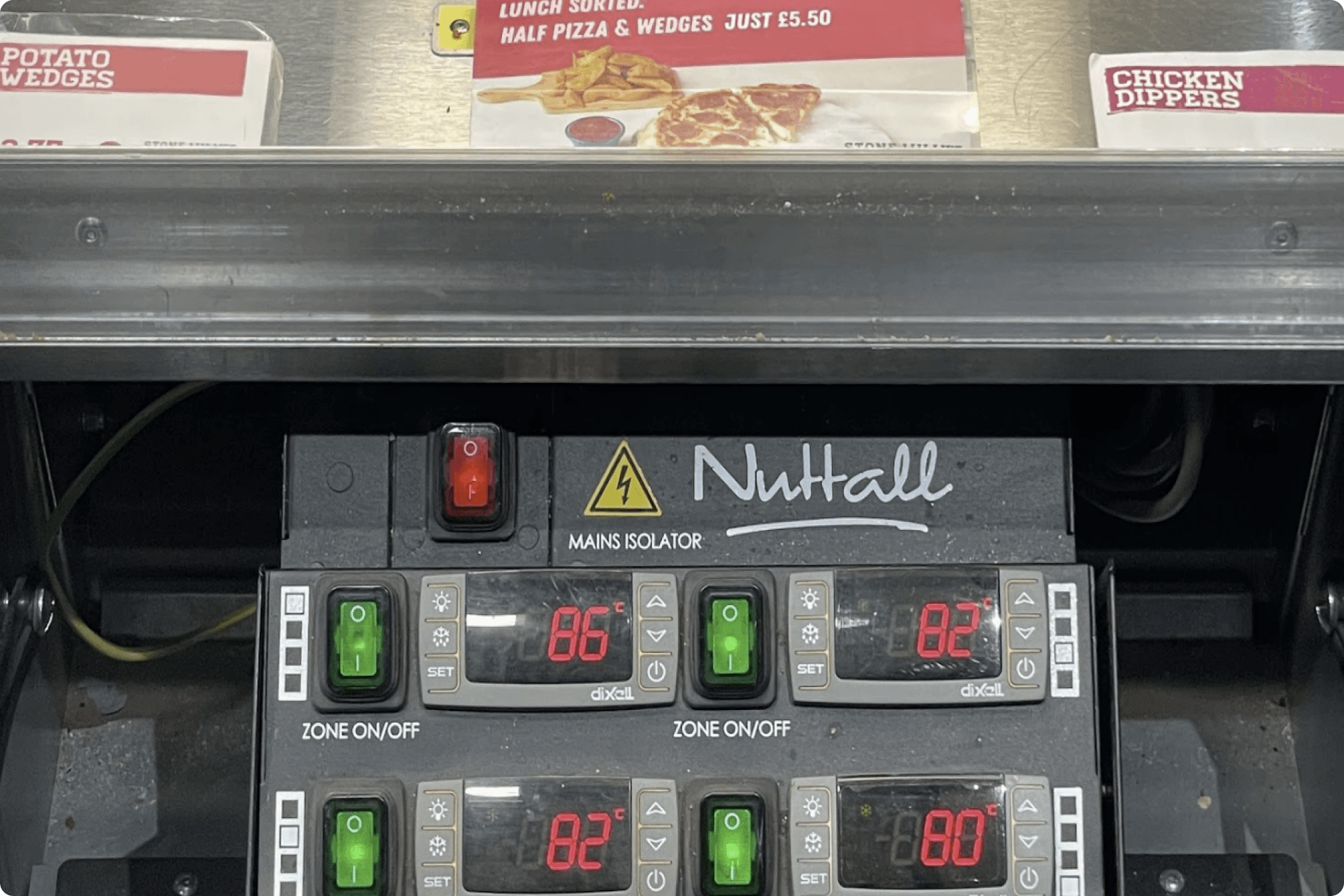
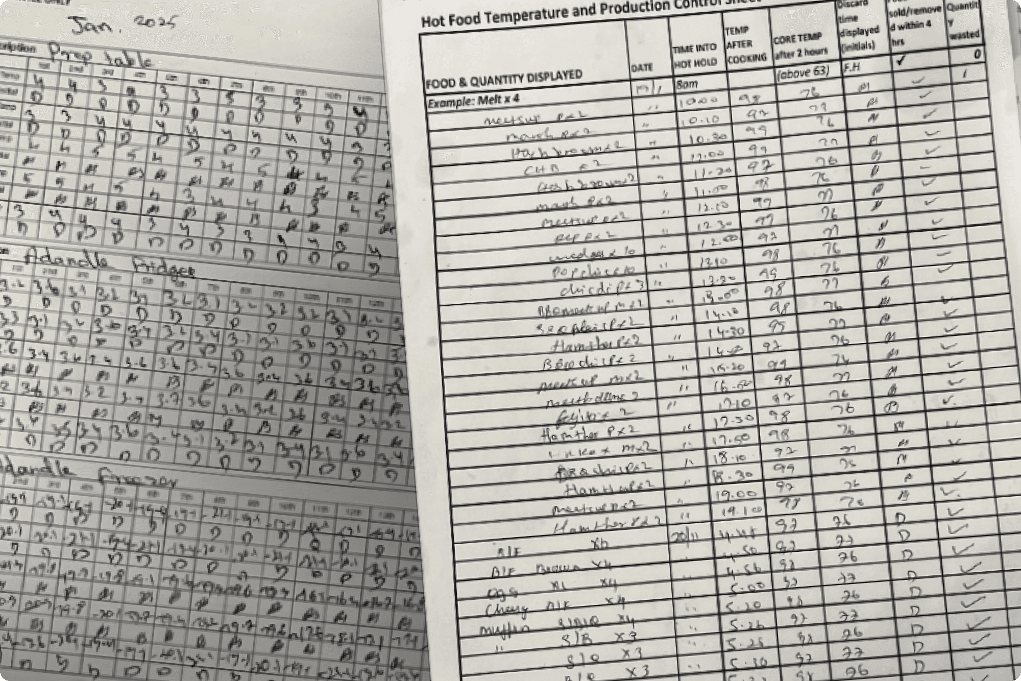
Pen and paper was still the only method of recording of food production and due-diligence within stores. This data from 80+ stores nationwide was being sent as a photo via Whatsapp and manually re-typed by the founder.
Pen and paper was still the only method of recording of food production and due-diligence within stores. This data from 80+ stores nationwide was being sent as a photo via Whatsapp and manually re-typed by the founder.
Solution
Solution
Bringing order to chaos. You can write here as much as you want, this text will always look nice, whether you write longer paragraphs or just a few words. Click here and try it out.
Bringing order to chaos. You can write here as much as you want, this text will always look nice, whether you write longer paragraphs or just a few words. Click here and try it out.
Understanding
Understanding
This wasn’t just another interface — it was a tool teams would rely on throughout the day, picking it up dozens of times to log tasks, track waste, or record temperatures. To design something that would genuinely fit into that routine, I started with conversations, sketches, and flow mapping rooted in real-world constraints. The goal was clear: create a system that felt invisible — fast, familiar, and unintrusive — in the chaos of a working kitchen.
This wasn’t just another interface — it was a tool teams would rely on throughout the day, picking it up dozens of times to log tasks, track waste, or record temperatures. To design something that would genuinely fit into that routine, I started with conversations, sketches, and flow mapping rooted in real-world constraints. The goal was clear: create a system that felt invisible — fast, familiar, and unintrusive — in the chaos of a working kitchen.

Physical constraints
Physical constraints
Physical constraints
Environmental factors
Environmental factors
Environmental factors
Existing processes
Existing processes
Existing processes
Product thinking
Product thinking
Before any screens were designed, I focused on the underlying product logic — how the system should function, scale, and serve different user groups. This meant deeply understanding the core problem, mapping the relationships between kitchens, retailers, and brands, and defining the product architecture to support both immediate needs and long-term growth. These early decisions ensured the experience was not just usable, but scalable and strategically sound beyond the MVP.
Before any screens were designed, I focused on the underlying product logic — how the system should function, scale, and serve different user groups. This meant deeply understanding the core problem, mapping the relationships between kitchens, retailers, and brands, and defining the product architecture to support both immediate needs and long-term growth. These early decisions ensured the experience was not just usable, but scalable and strategically sound beyond the MVP.
Understanding real world application
Understanding real world application
It was essential to truly understand the day-to-day processes this product would be replacing. Multiple site visits we're undertaken, often recording our conversations with staff to analyse later.
It was essential to truly understand the day-to-day processes this product would be replacing. Multiple site visits we're undertaken, often recording our conversations with staff to analyse later.

Scalable product structure
Scalable product structure
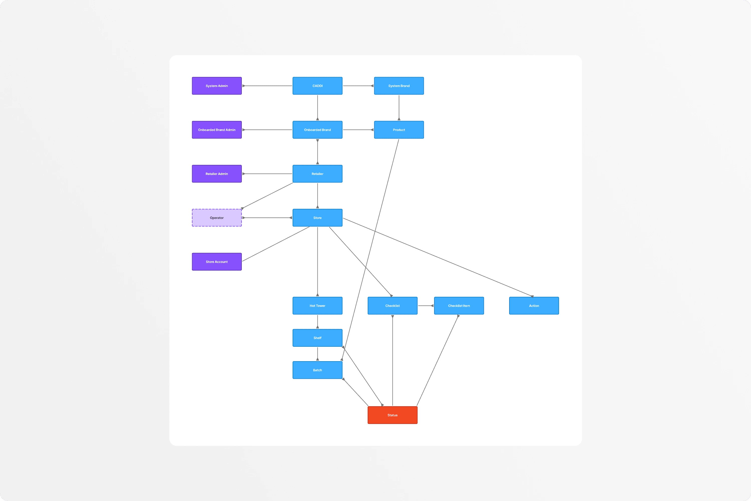
Beyond design, we acted as strategic partners — helping define how the product should be structured to support future growth. We mapped out data ownership, user roles, and system boundaries: what should be managed in-app, what lives in the backend, and how data could flow to retailers and brands. These decisions laid the foundation for a product that wasn’t just functional at launch, but scalable and adaptable.
Beyond design, we acted as strategic partners — helping define how the product should be structured to support future growth. We mapped out data ownership, user roles, and system boundaries: what should be managed in-app, what lives in the backend, and how data could flow to retailers and brands. These decisions laid the foundation for a product that wasn’t just functional at launch, but scalable and adaptable.
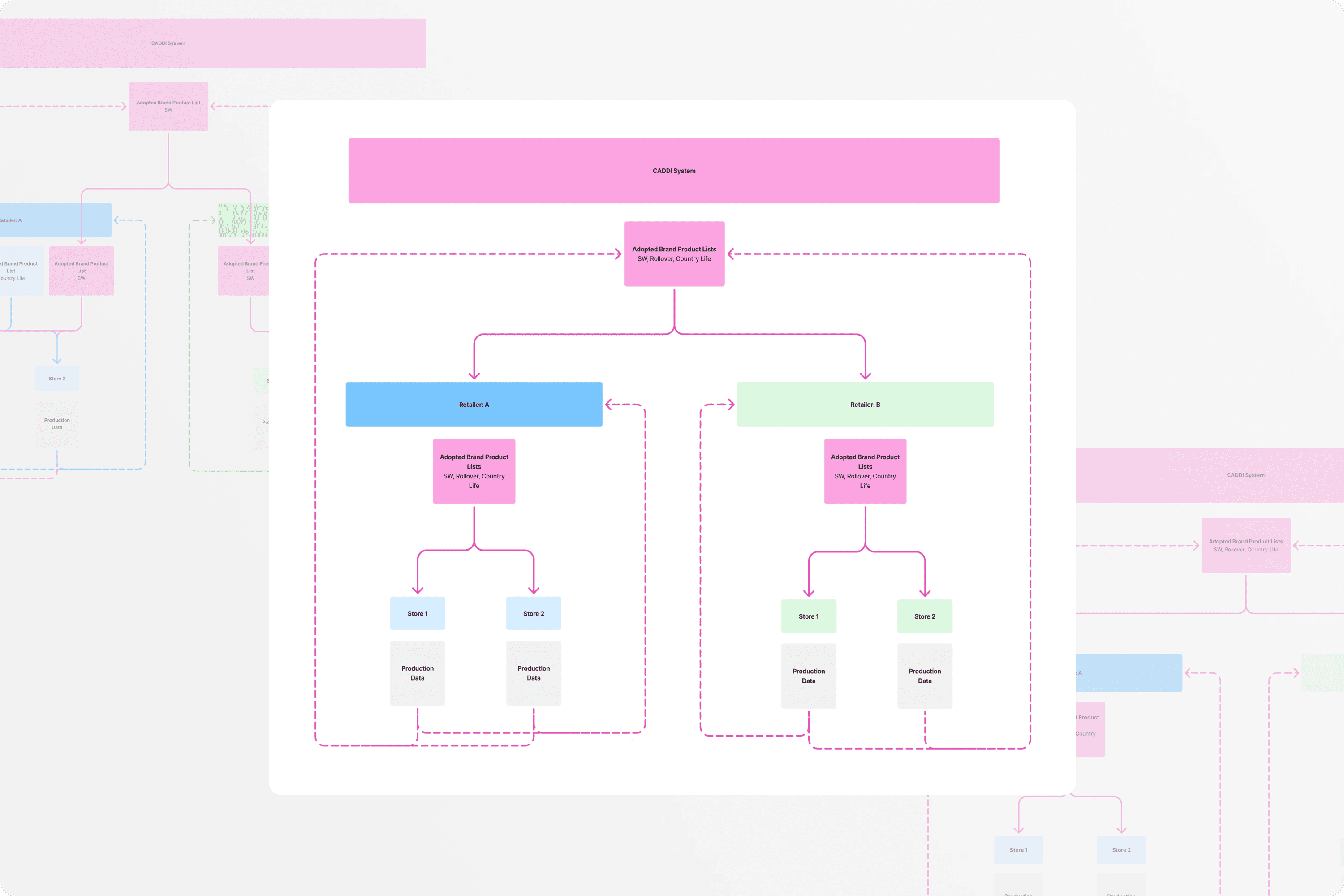
Mapping entity relationships
Mapping entity relationships
Early on, I broke the system down into its most abstract components and mapped how they related. This helped clarify one-to-one vs. one-to-many relationships etc. uncover hidden dependencies, and ensure the product architecture supported real-world complexity without becoming fragile or rigid.
Early on, I broke the system down into its most abstract components and mapped how they related. This helped clarify one-to-one vs. one-to-many relationships etc. uncover hidden dependencies, and ensure the product architecture supported real-world complexity without becoming fragile or rigid.
My Proccess
My Proccess
Designing this product meant more than creating screens — it required building a system that aligned with real behaviours, tight workflows, and environmental constraints. I followed a focused, iterative process that moved quickly from rough ideas to structured prototypes, always validating decisions through real-world context and collaboration.
Designing this product meant more than creating screens — it required building a system that aligned with real behaviours, tight workflows, and environmental constraints. I followed a focused, iterative process that moved quickly from rough ideas to structured prototypes, always validating decisions through real-world context and collaboration.
Iterative Design
Iterative Design
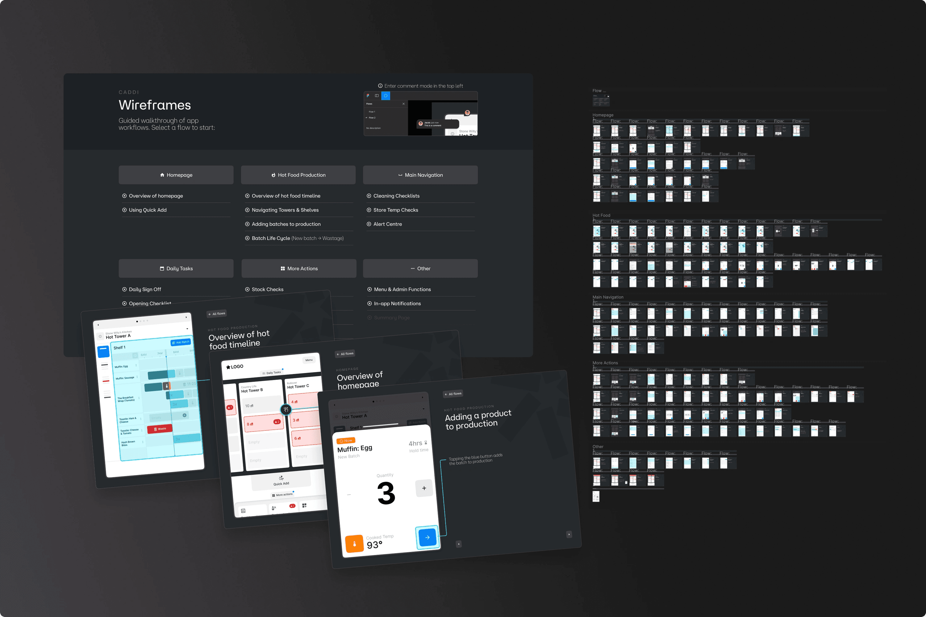
I moved quickly from rough sketches to low-fidelity wireframes, testing flows and interactions before refining into higher-fidelity UI. Each stage helped uncover friction points early, from tap accuracy to layout density. I used Figma Mirror throughout to evaluate designs directly on a tablet, ensuring they worked in context, not just on screen. Prototypes were continuously tested and refined until the final UI was both robust and invisible in use.
I moved quickly from rough sketches to low-fidelity wireframes, testing flows and interactions before refining into higher-fidelity UI. Each stage helped uncover friction points early, from tap accuracy to layout density. I used Figma Mirror throughout to evaluate designs directly on a tablet, ensuring they worked in context, not just on screen. Prototypes were continuously tested and refined until the final UI was both robust and invisible in use.

Extensive wireframes
Extensive wireframes
I built fully interactive wireframe prototypes that were deeply structured and thoroughly annotated. Every interaction, state, and behaviour was clearly mapped out to remove ambiguity and ensure functional clarity. This made it easy for non-technical stakeholders to give meaningful input early, long before visual design began — reducing surprises, rework, and misalignment down the line.
I built fully interactive wireframe prototypes that were deeply structured and thoroughly annotated. Every interaction, state, and behaviour was clearly mapped out to remove ambiguity and ensure functional clarity. This made it easy for non-technical stakeholders to give meaningful input early, long before visual design began — reducing surprises, rework, and misalignment down the line.
UI Design
UI Design
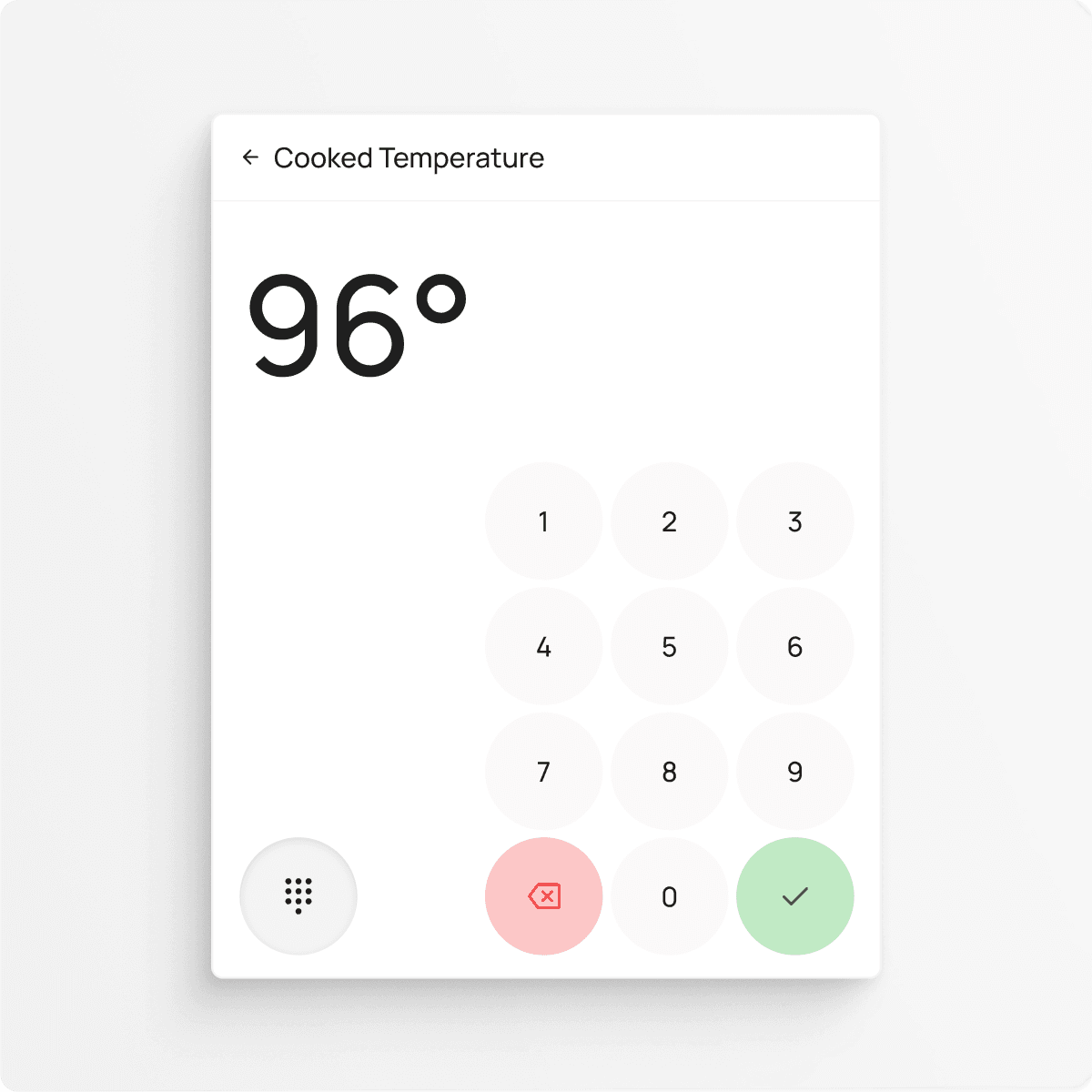
With the foundations in place, the focus shifted to designing a clean, resilient interface that could hold up in real-world conditions. Every element was built for clarity, speed, and ease of use — from oversized tap targets to simplified layouts. The goal was to create a UI that felt invisible in use: intuitive enough to disappear, robust enough to be trusted, and flexible enough to scale.
With the foundations in place, the focus shifted to designing a clean, resilient interface that could hold up in real-world conditions. Every element was built for clarity, speed, and ease of use — from oversized tap targets to simplified layouts. The goal was to create a UI that felt invisible in use: intuitive enough to disappear, robust enough to be trusted, and flexible enough to scale.
This wasn’t about simplicity for its own sake — it was about making the product work without hesitation or confusion.
This wasn’t about simplicity for its own sake — it was about making the product work without hesitation or confusion.
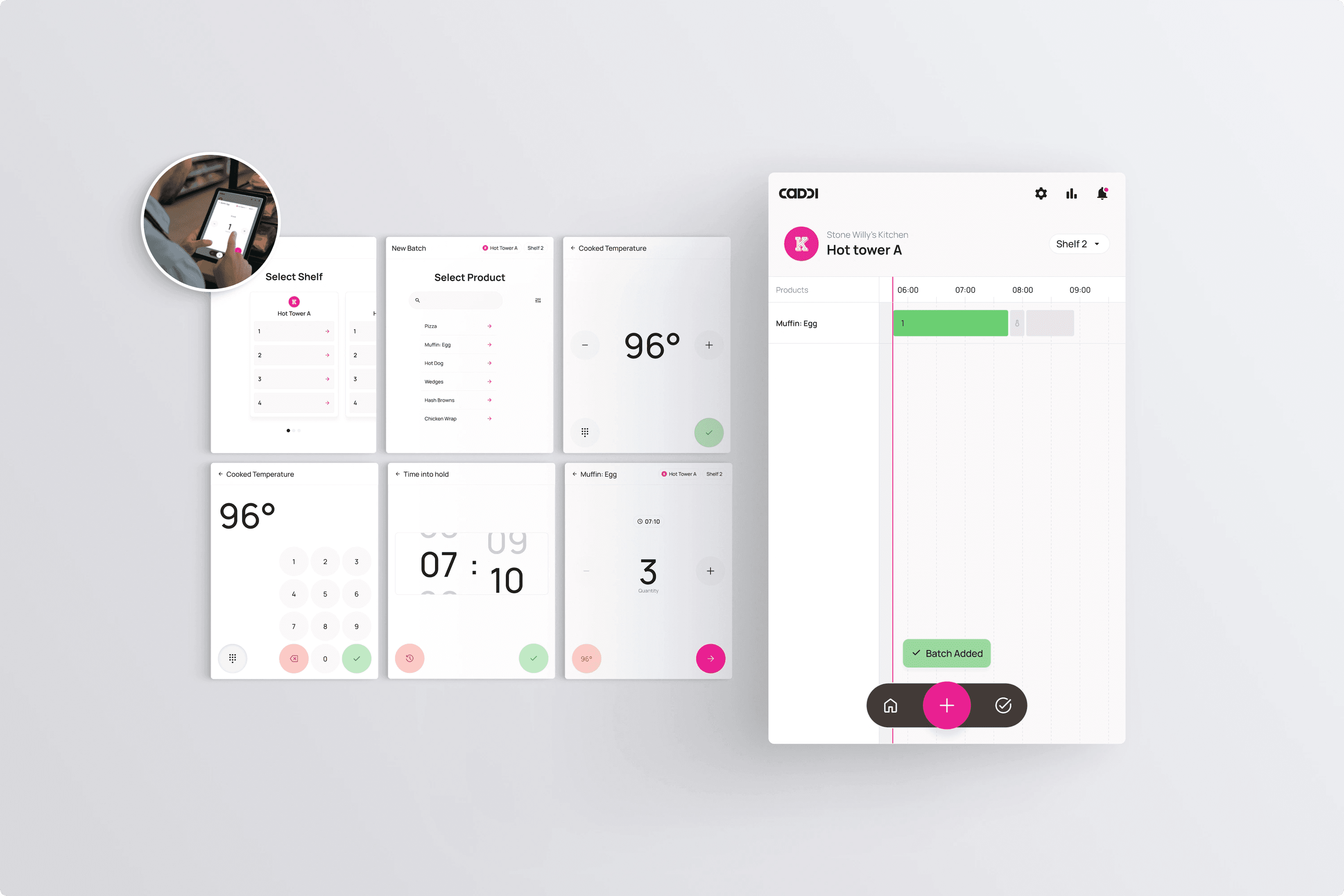

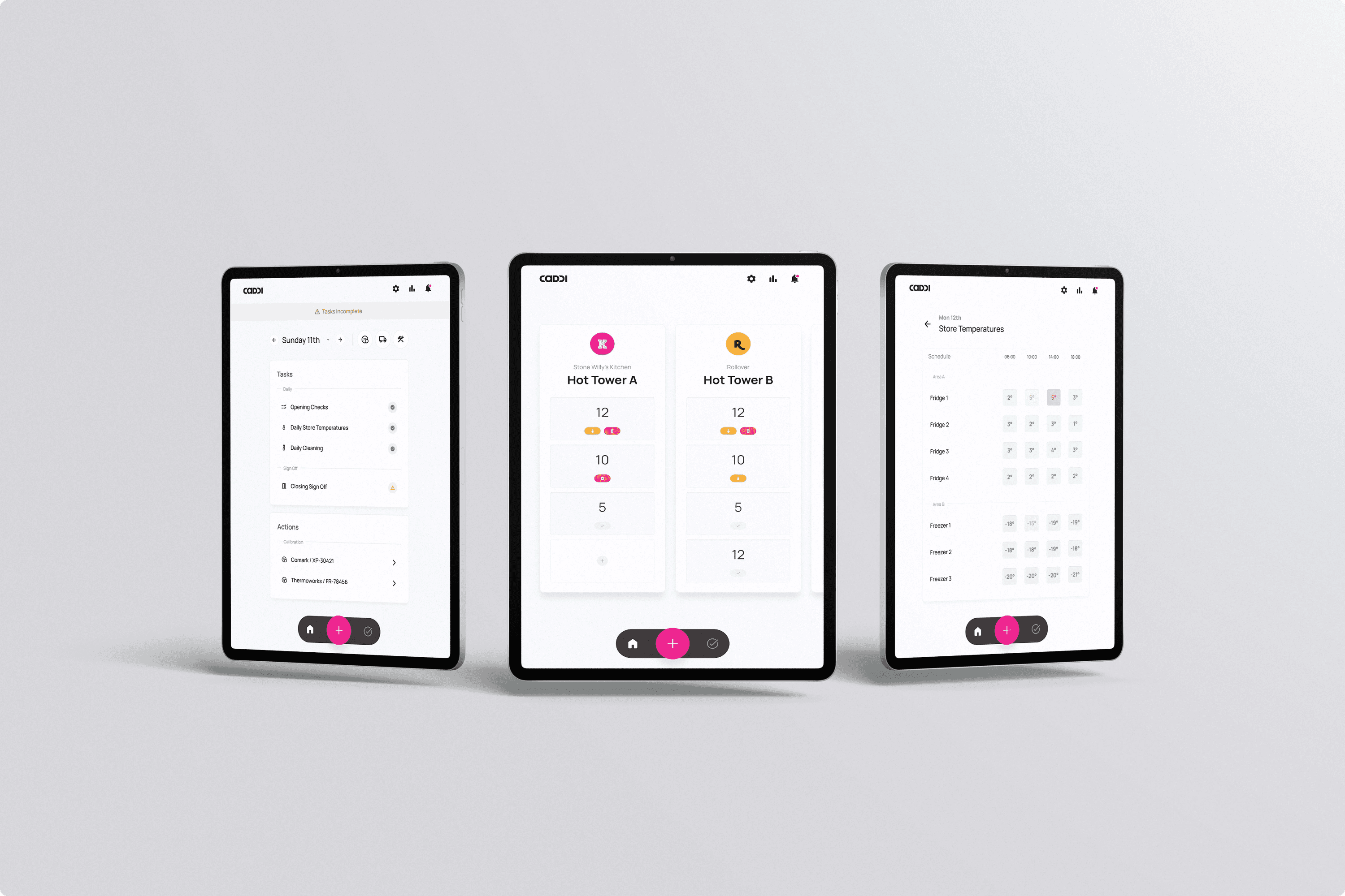


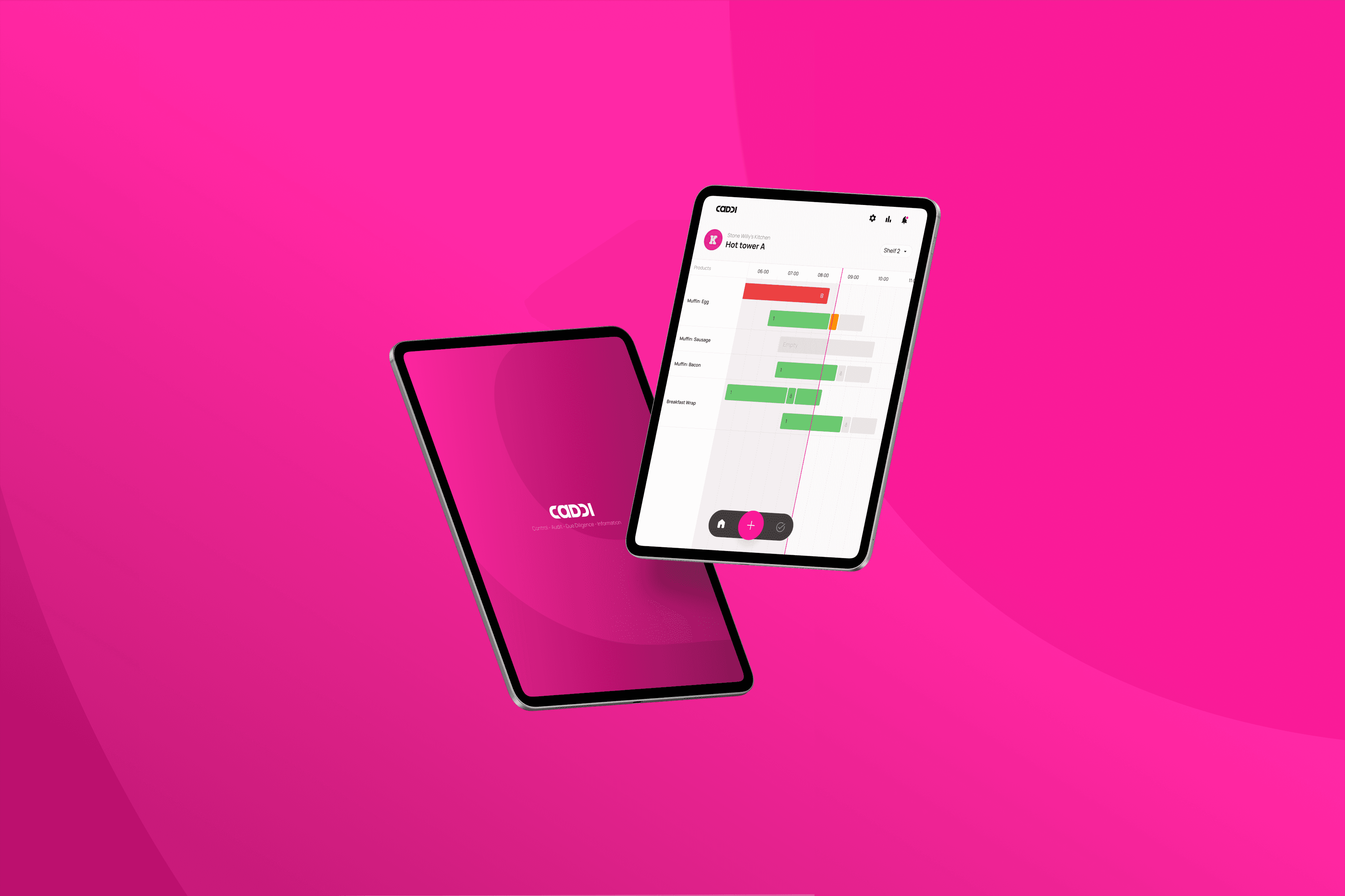
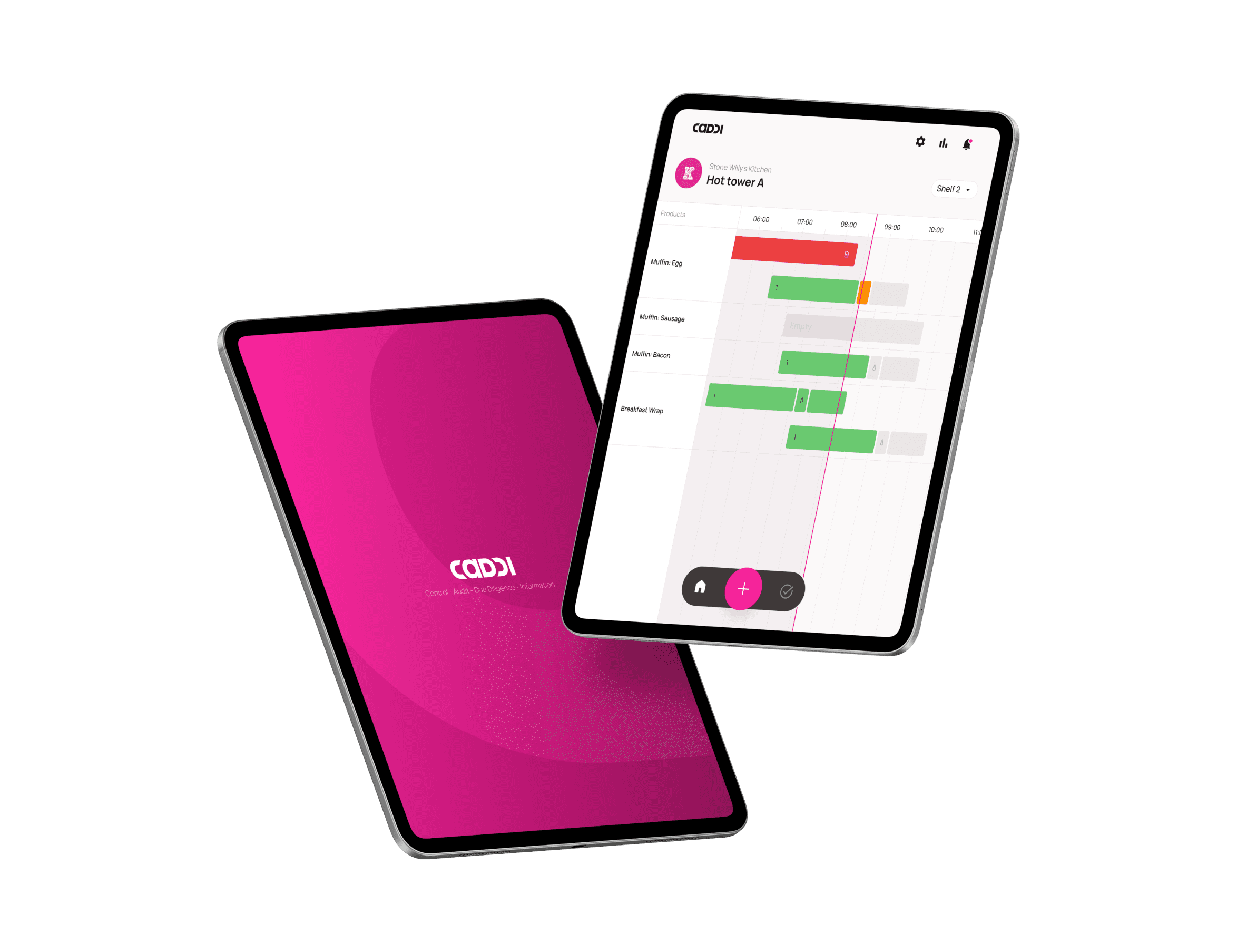
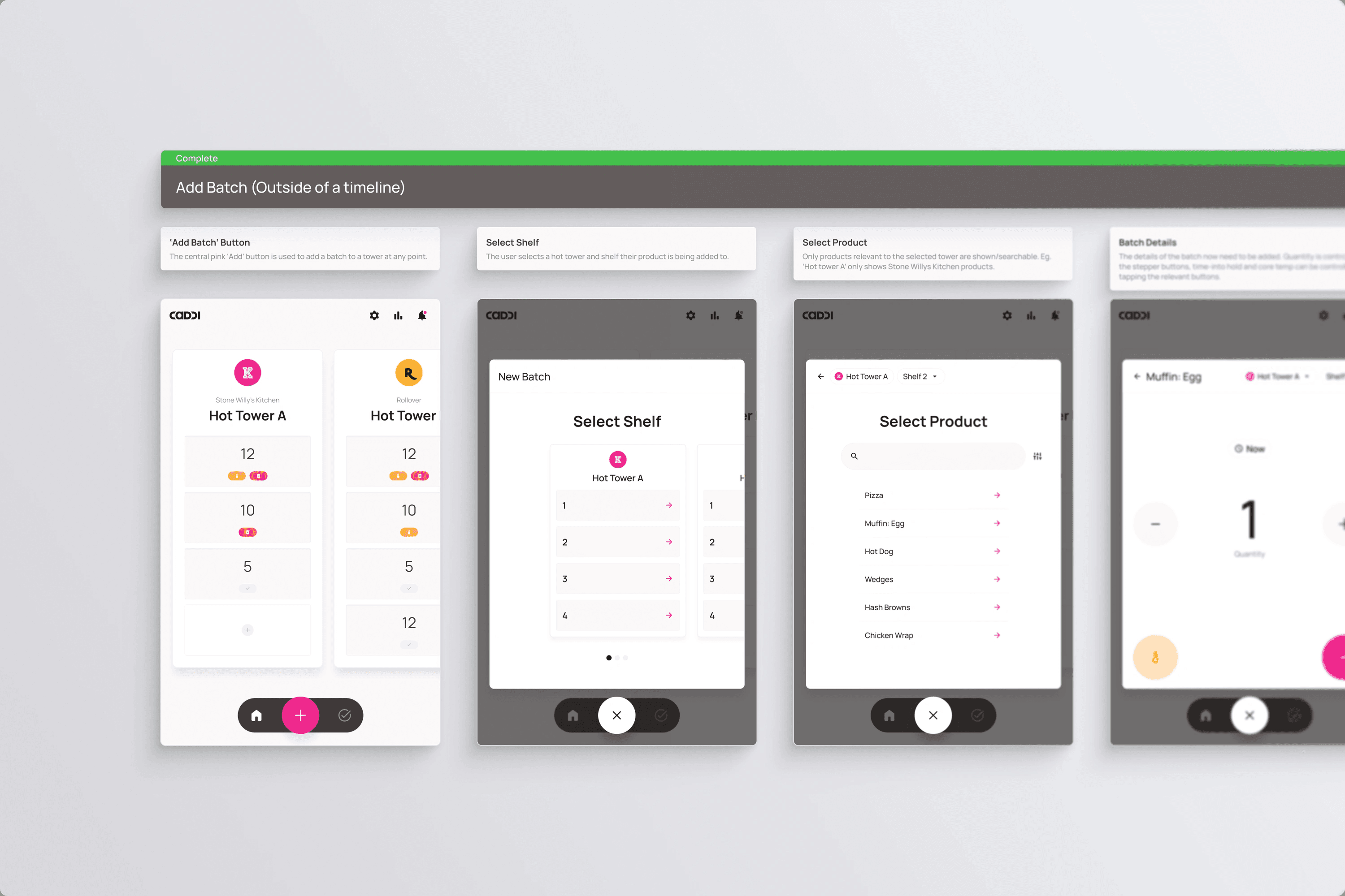
Hot Towers
Hot Towers
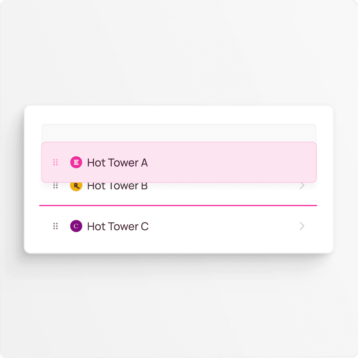
The home screen serves as the central hub of the app. Since stores typically manage multiple brands and hot towers, ensuring each shelf was accessible with a single tap was a essential.
The home screen serves as the central hub of the app. Since stores typically manage multiple brands and hot towers, ensuring each shelf was accessible with a single tap was a essential.

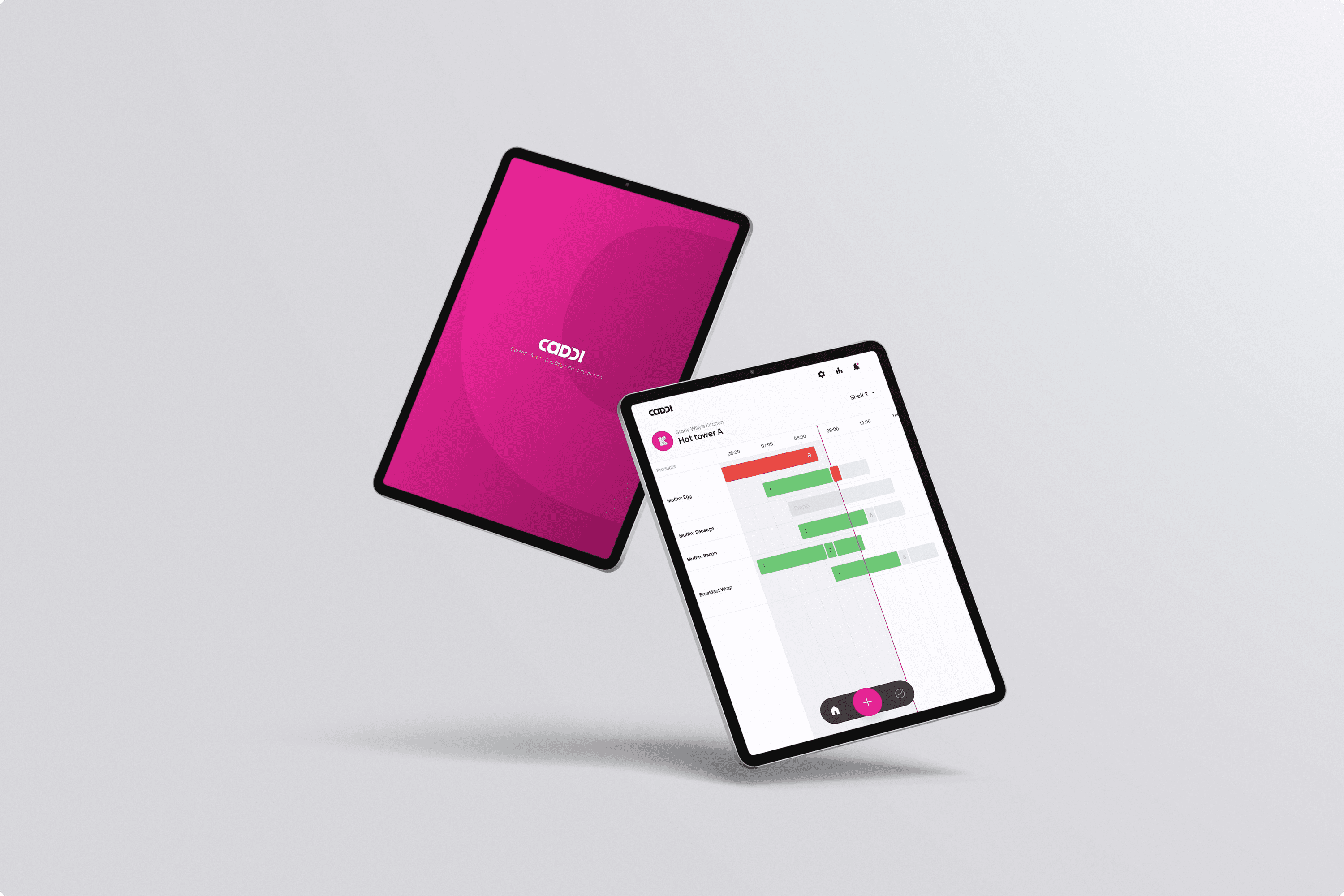
Food production
Food production
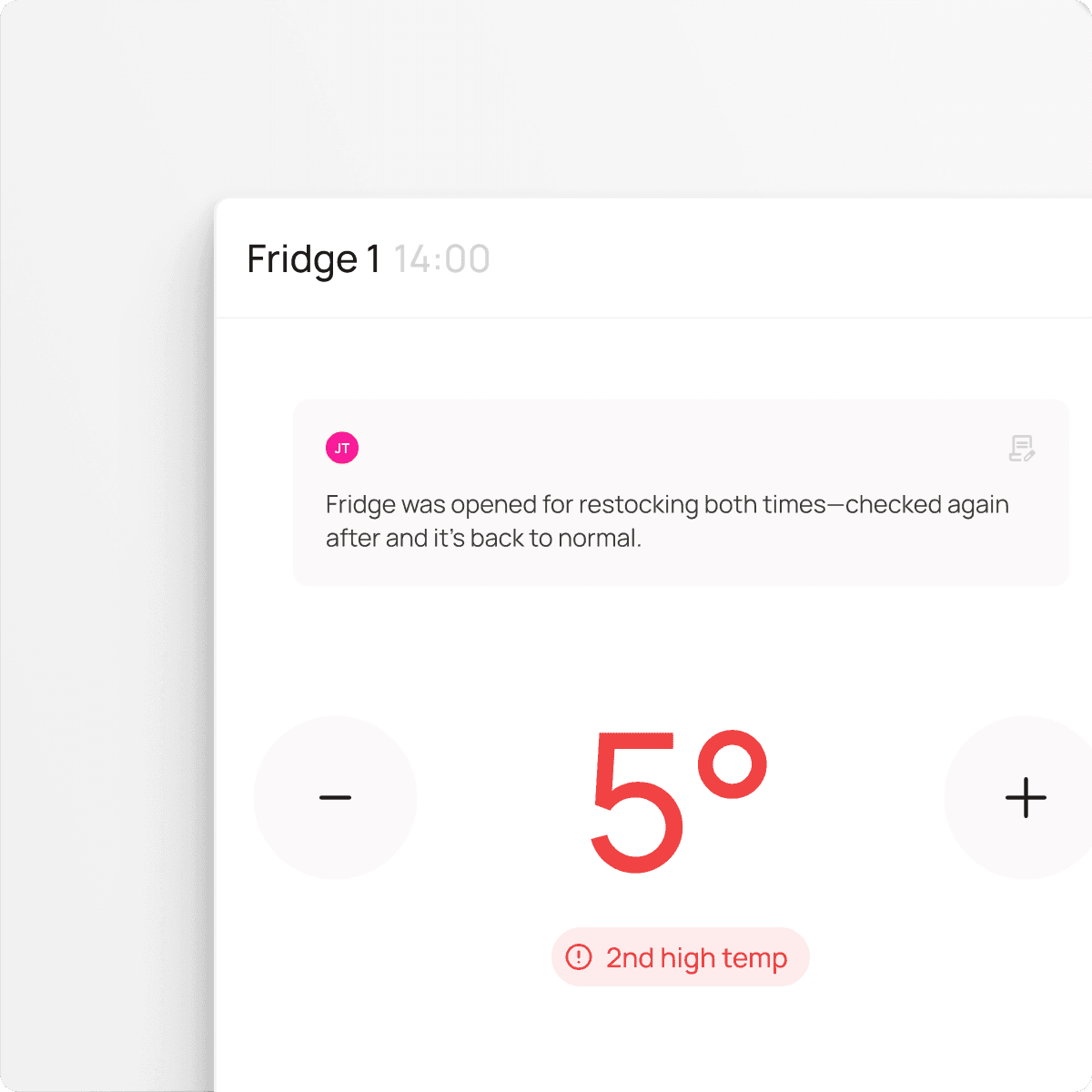
The food production timeline is the highest-traffic screen in the app, so balancing detail with simplicity was a key focus. It provides users with full visibility of their products while ensuring batch functions remain predictable and intuitive.
The food production timeline is the highest-traffic screen in the app, so balancing detail with simplicity was a key focus. It provides users with full visibility of their products while ensuring batch functions remain predictable and intuitive.
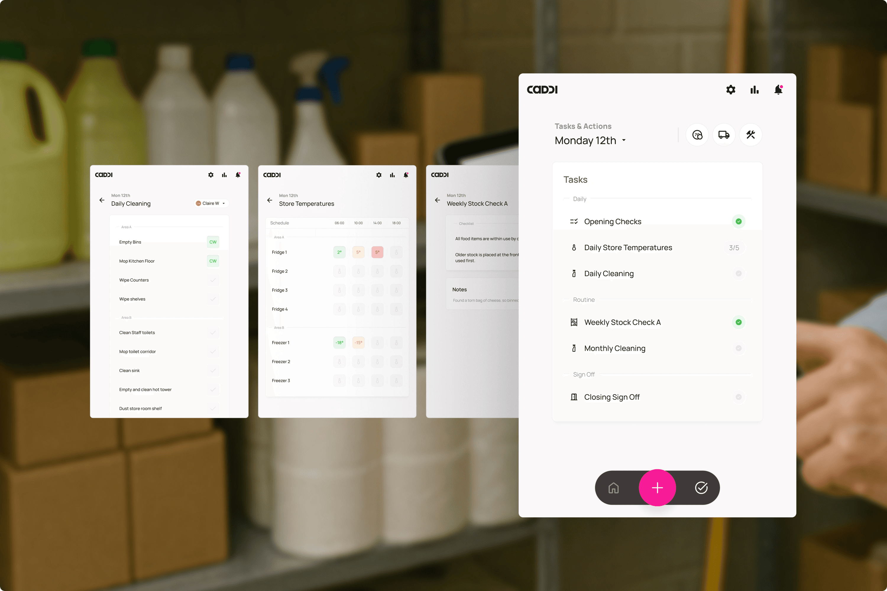
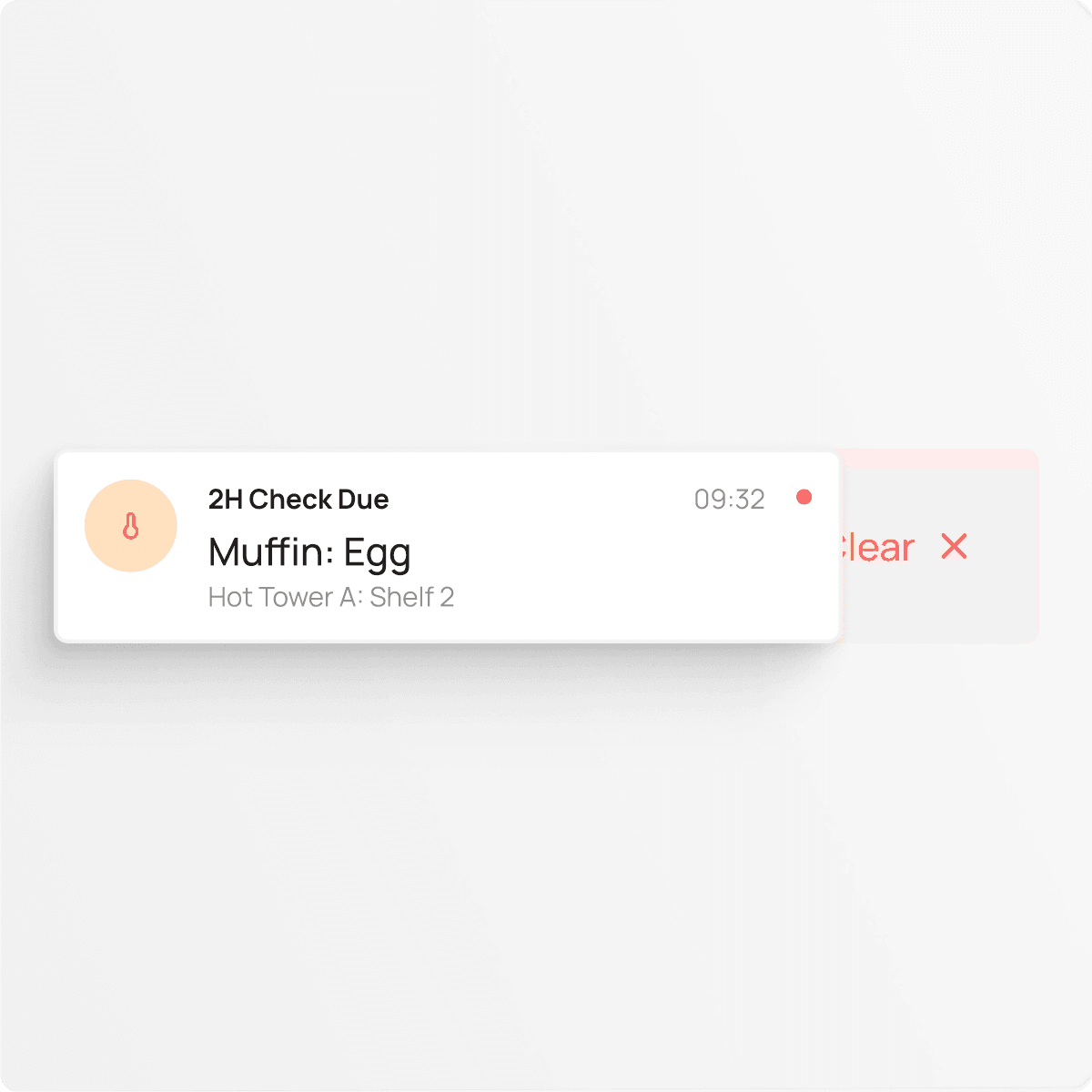
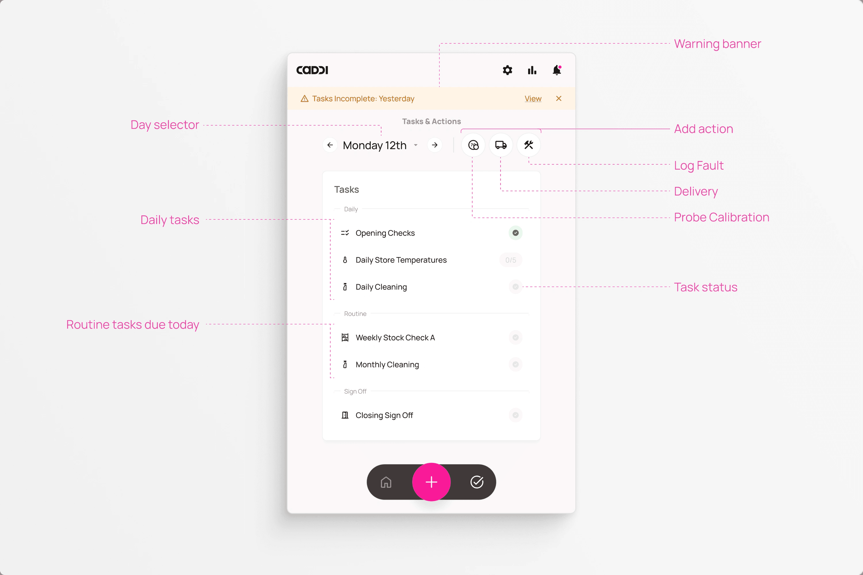
Tasks & Actions
Tasks & Actions
The tasks and actions section demonstrates how a digital product can simplify users’ workflows. Previously, task entry was spread across more than seven pages of a physical booklet, with some tasks occurring bi-monthly and others multiple times daily. By consolidating these into a clear daily ‘to-do’ list, the system reduces the cognitive load on operators, allowing them to focus and work more efficiently.
The tasks and actions section demonstrates how a digital product can simplify users’ workflows. Previously, task entry was spread across more than seven pages of a physical booklet, with some tasks occurring bi-monthly and others multiple times daily. By consolidating these into a clear daily ‘to-do’ list, the system reduces the cognitive load on operators, allowing them to focus and work more efficiently.
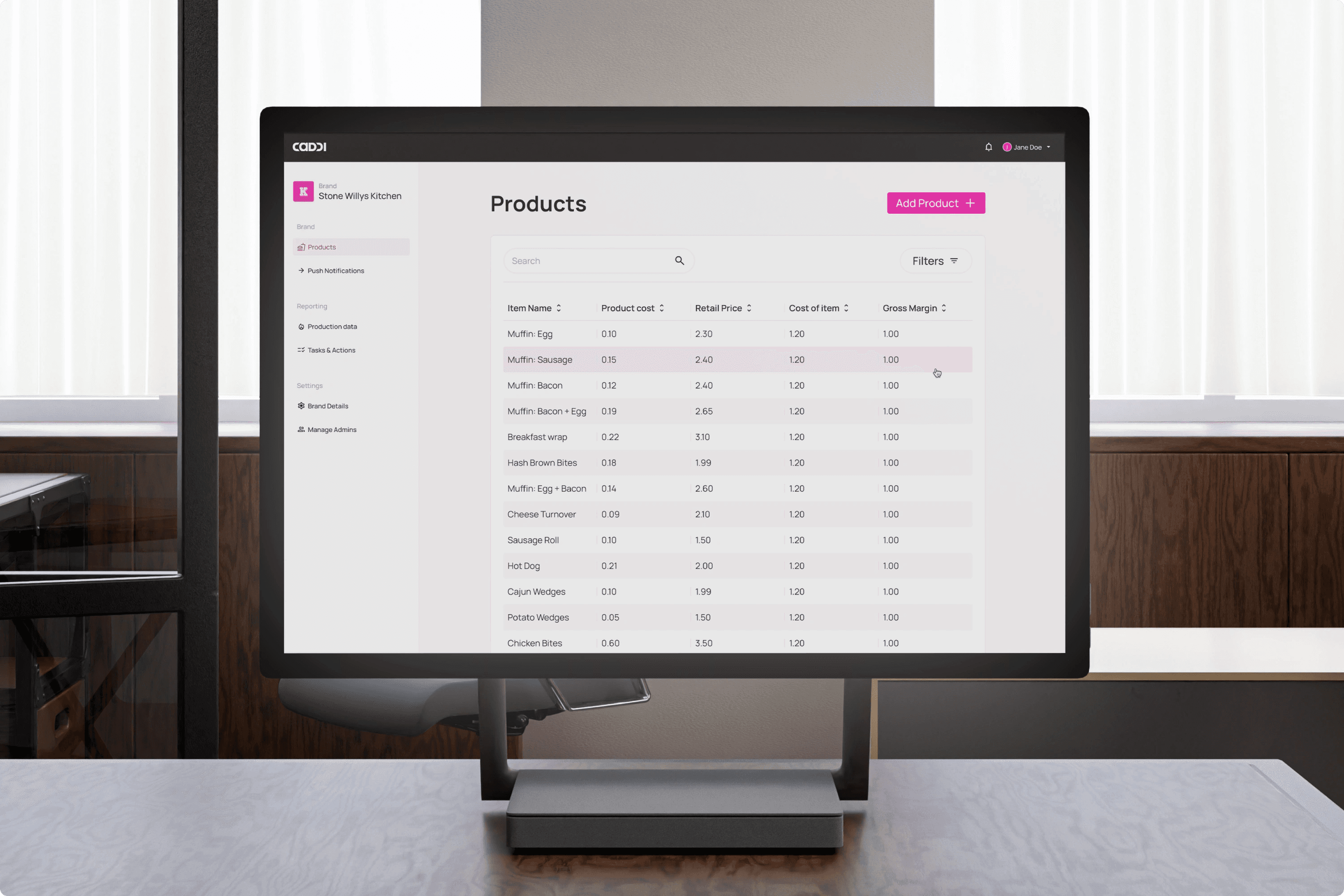
Centralised admin
Centralised admin
The admin system allows for comprehensive data viewing and analysis across all stores. It also provides control over products, hot towers, brands, and other key elements, enabling efficient management at scale
The admin system allows for comprehensive data viewing and analysis across all stores. It also provides control over products, hot towers, brands, and other key elements, enabling efficient management at scale
Designed for delivery
Designed for delivery
From the start, I approached the design process with developer handover as a priority. Every detail was annotated and documented to reduce friction, minimise confusion, and save time—ensuring the development team could work efficiently and deliver smoothly without having to refer to me for clarification.
From the start, I approached the design process with developer handover as a priority. Every detail was annotated and documented to reduce friction, minimise confusion, and save time—ensuring the development team could work efficiently and deliver smoothly without having to refer to me for clarification.
Zero guesswork
Zero guesswork
I meticulously annotated every single screen across all user flows, detailing exactly what was happening at each step. This left no room for ambiguity and created a comprehensive archive of design intent. As a result, developers had all the context they needed upfront, drastically reducing time spent on clarifications and smoothing the handover process significantly.
I meticulously annotated every single screen across all user flows, detailing exactly what was happening at each step. This left no room for ambiguity and created a comprehensive archive of design intent. As a result, developers had all the context they needed upfront, drastically reducing time spent on clarifications and smoothing the handover process significantly.
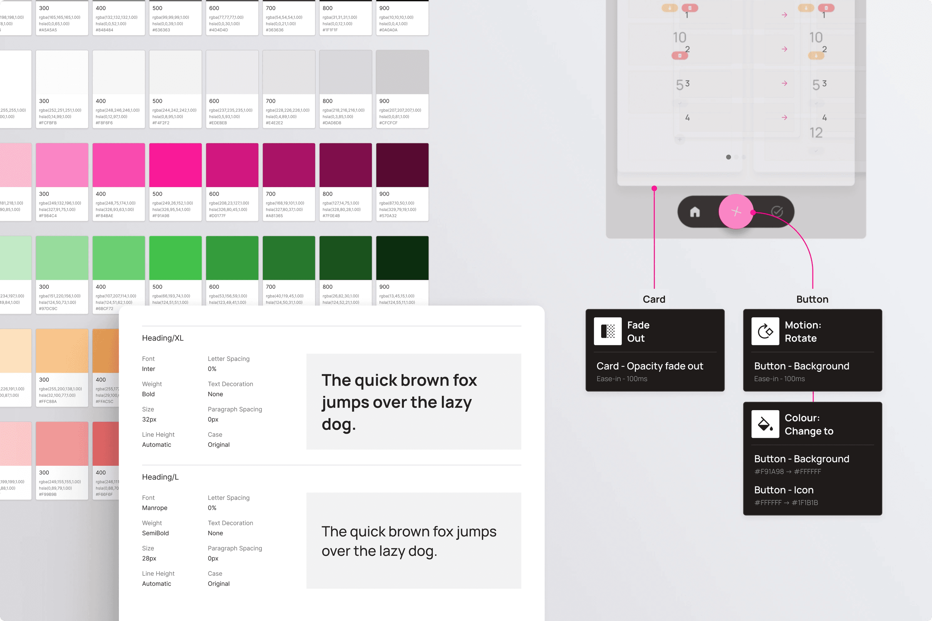
Documentation
Documentation
A solid, reusable design system was built to support both iOS and Android platforms from the start. Variables were used across typography, spacing, colours, and components to ensure consistency and efficiency. Beyond visual styles, I also documented behavioural patterns — including motion, transitions, and haptics — so interaction felt deliberate and native across platforms. This foundation made scaling and iteration faster, while keeping implementation clear and predictable for developers.
A solid, reusable design system was built to support both iOS and Android platforms from the start. Variables were used across typography, spacing, colours, and components to ensure consistency and efficiency. Beyond visual styles, I also documented behavioural patterns — including motion, transitions, and haptics — so interaction felt deliberate and native across platforms. This foundation made scaling and iteration faster, while keeping implementation clear and predictable for developers.
Impact
Impact
The product is set to launch in stores soon, with rollout planned across 80+ sites. As it goes live, real-world feedback will inform ongoing iteration and refinement to ensure it continues to meet the needs of users.
Phase 2 will focus on positioning the platform as a SaaS product, making it available to other retailers and brands. There is already interest from nationwide operators and the system has been built with that scale in mind.
Takeaways
Takeaways
This project reinforced the value of designing with implementation in mind from day one. Thinking about structure, scalability, and developer needs early made the entire process smoother and more efficient.
It also highlighted the importance of staying close to real-world use — designing not just for screens, but for the actual environments, behaviours, and constraints the product would live in. Balancing simplicity with functionality in that context was a valuable challenge.
Finally, working directly with non-technical founders showed how important clear communication and shared understanding are, especially when building something from the ground up.